UX Hackathon - The Royal Caribbean

Service

UX Designer

Client

The Royal Caribbean

Duration

24 hours

Date

2024

A collaborative hackathon challenge where UX, data science, and engineering united to redefine the online cruise experience for newcomers. As one of two UX designers, I helped craft an inviting, intuitive interface by refining the information architecture and interactive elements. Our data science team integrated authentic customer reviews, and software engineers built a robust backend, ensuring a seamless and engaging journey for first-time cruisers.

Problem Space

The "new-to-cruise" demographic consists of potential customers new to cruising as a holiday option. These individuals struggle with understanding cruise-specific terminology and the variety of offerings, leading to confusion and a disjointed information search. Their limited knowledge not only fuels frustration but also increases their hesitance towards cruising. For cruise lines, it is crucial to address the needs of these first-time cruisers with clear, comprehensive marketing and user-friendly online experiences to effectively engage and convert them into booking their first cruise.

How might we?

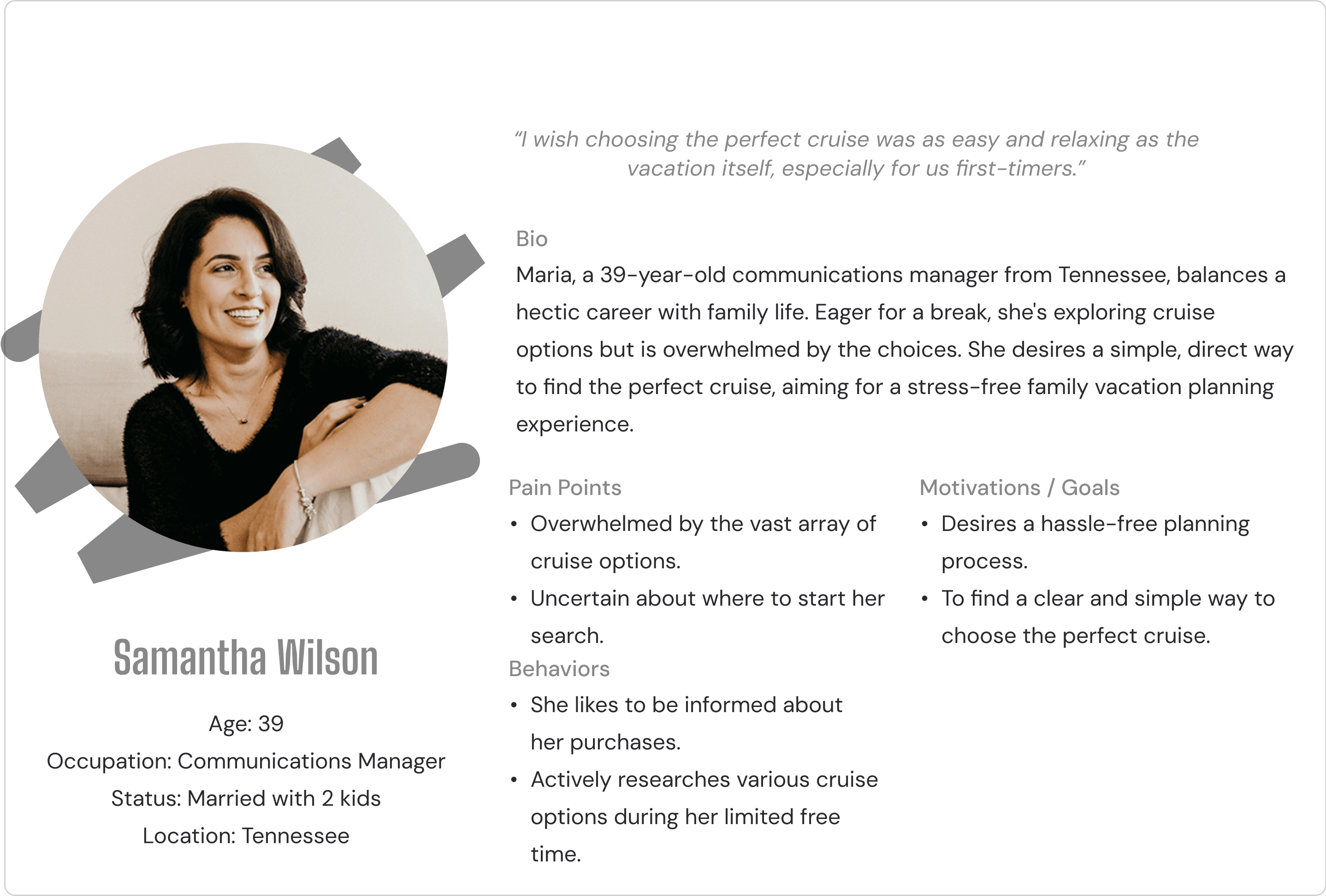
In our hackathon project, we were given a "How Might We" (HMW) statement by the organizers after a brief overview of the problem space, which focused on the unique challenges faced by first-time cruisers. This statement served as our guiding framework as we grouped into collaborative teams.

How might we offer learning opportunities and deliver a unique shopping experience for the “new-to-cruise” customers that inspire confidence in their purchase?

How might we offer learning opportunities and deliver a unique shopping experience for the “new-to-cruise” customers that inspire confidence in their purchase?

How might we offer learning opportunities and deliver a unique shopping experience for the “new-to-cruise” customers that inspire confidence in their purchase?

User Journey Mapping

Our team conducted a detailed user journey mapping to trace the entire process of food management from purchasing to disposal. We specifically focused on the "Cook a Meal" stage, identifying it as a critical point where strategic interventions could foster more sustainable cooking behaviors. By enhancing this key stage with tailored features like personalized recipe suggestions and efficient meal planning, EcoChef not only boosts kitchen efficiency but also significantly contributes to environmental sustainability and reduces food waste.

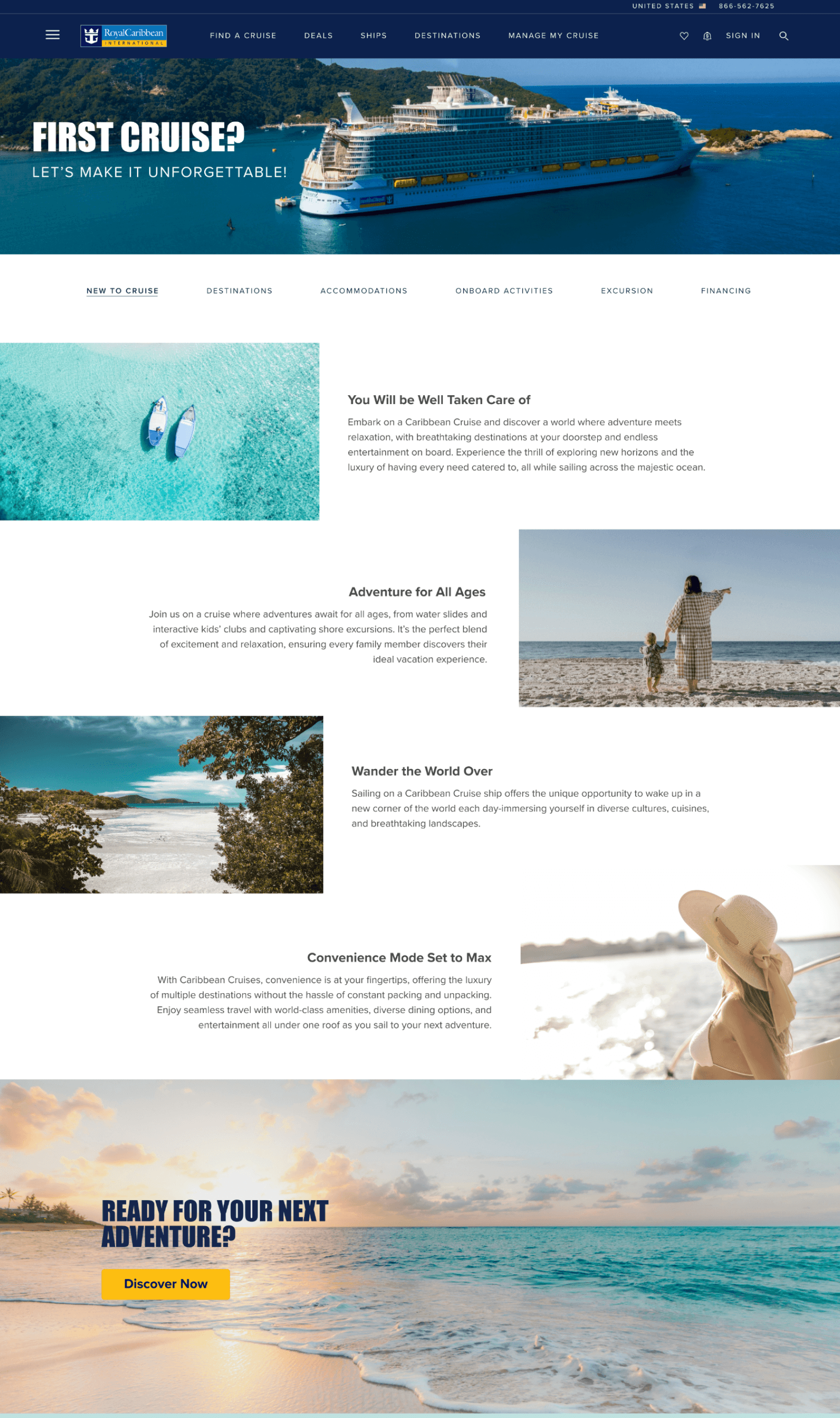
Landing Page Comparison

Realizing the “new to cruise” section was too cluttered, we redesigned it to include a dedicated page that solely introduces the concept of cruising. This new page provides a clear, straightforward explanation of what cruising involves, without any sales-oriented information. Our aim was to educate newcomers about cruising in a simple, uncluttered format, enhancing their understanding and comfort with the idea before they explore cruise options.

As a group, we started sketching various layout concepts for the EcoChef and selected the strongest idea to develop further.

Before

After

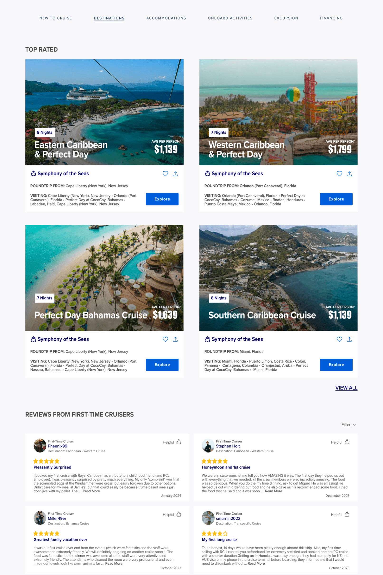
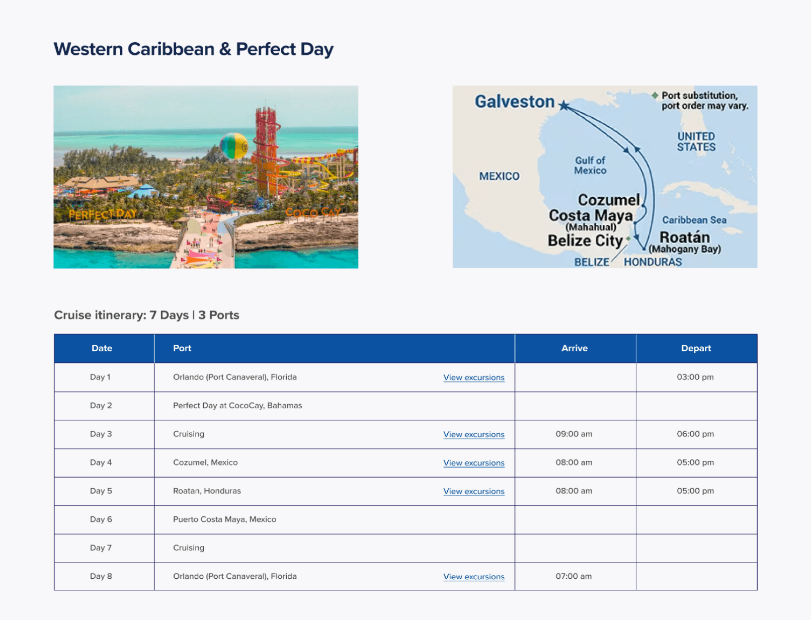
Destination Page Comparison

Instead of overwhelming new users with a full listing of all cruises, we introduced a "Top Rated Cruises" section. This feature highlights highly rated cruises and incorporates real customer reviews, collected by our data science team, to simplify the decision-making process. It simplifies the decision-making process, enabling new cruisers to easily choose their ideal cruise based on positive feedback.

As a group, we started sketching various layout concepts for the EcoChef and selected the strongest idea to develop further.

Before

After

Booking Page Comparison

We prioritized accessibility over purely aesthetic considerations, ensuring that the layout was easy to read and understand. This led to a clearer visual hierarchy that improves navigation and comprehension. We included a geographical map for immediate contextual clarity, enhancing users' understanding of the cruise route. Additionally, the chart's simplified design, logical arrangement of dates and ports, and clear visual markers for key details further facilitate ease of use and understanding.

As a group, we started sketching various layout concepts for the EcoChef and selected the strongest idea to develop further.

Before

After

Key Learnings &
Next Steps

Collaborating in a group proved essential during our 24-hour hackathon, as it allowed us to combine diverse skills and insights, crucial for enhancing the UX and accessibility of the cruise website. Effective time management was key; we prioritized tasks and maintained clear communication to ensure efficient progress and meet our tight deadline.


Our focus on improving the website’s UX taught us the importance of simplifying the user journey and enhancing visual clarity. These adjustments made the site more intuitive for first-time cruisers, demonstrating how thoughtful UX design can significantly boost user accessibility and satisfaction.

1. User Testing

Conduct thorough testing with real users, particularly targeting first-time cruisers, to gather feedback on the redesigned website’s intuitiveness.

2. Accessibility Audit

Perform detailed accessibility audits to ensure the website meets all relevant accessibility standards.

  1. Incorporating more features

I intend to integrate new features, such as mentorship and daily shadowing, to broaden the app’s capabilities.

  1. Re-Testing

After incorporating the latest features, I plan to conduct further testing to affirm the usability.

  1. Design for Multiplatform Use

Tailoring Spark for both mobile and computer platforms will enhance the video learning feature, offering a more immersive experience on larger screens.

RELATED PROJECTS